Challenge
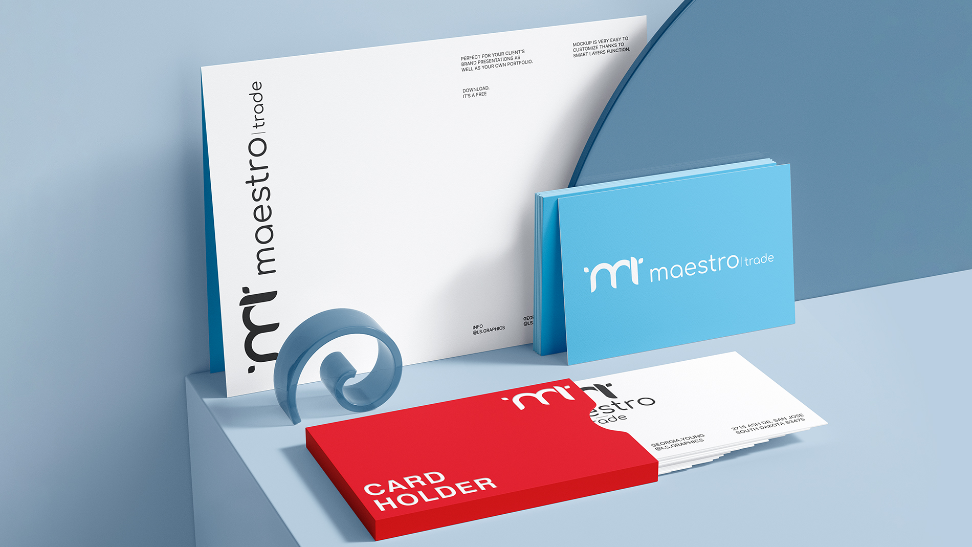
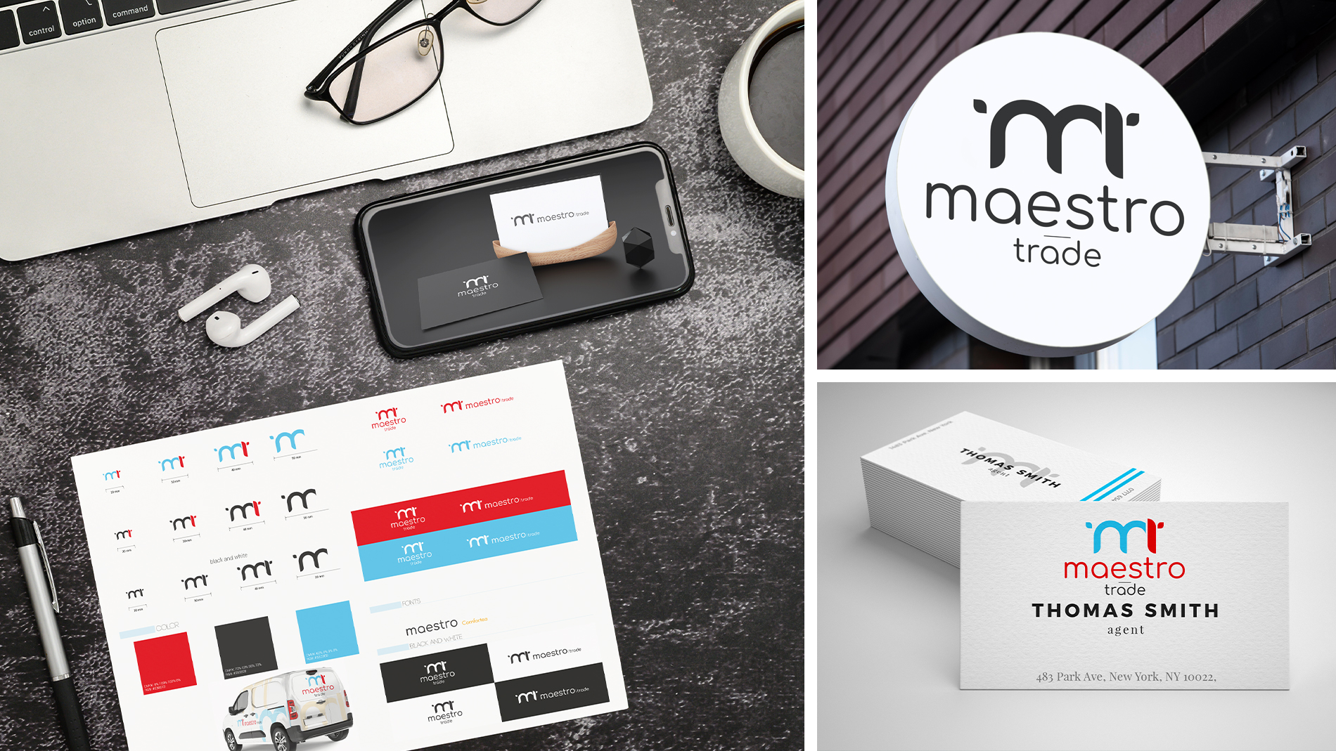
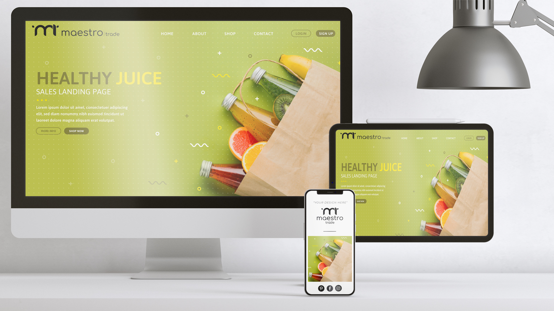
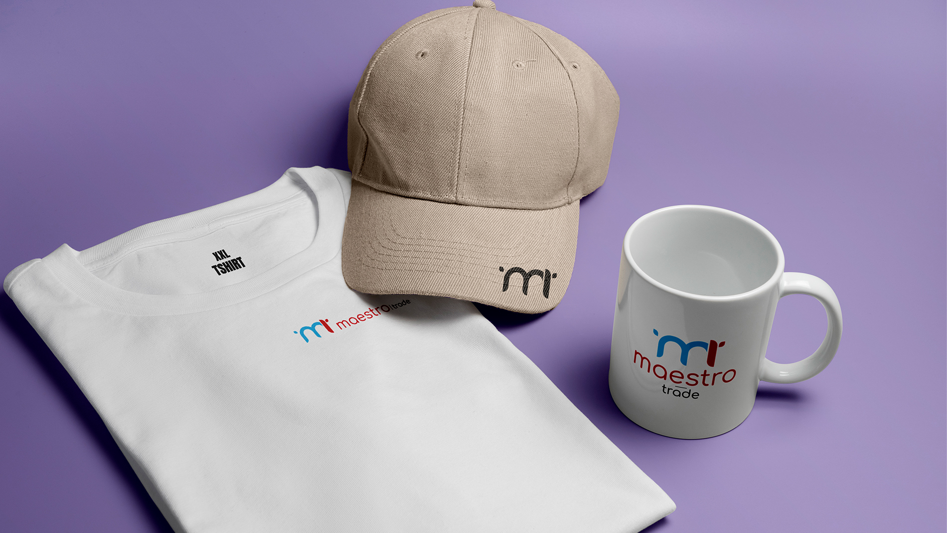
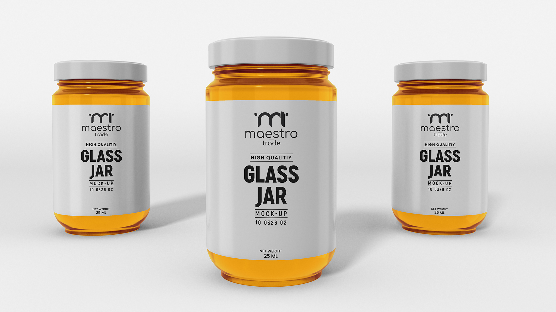
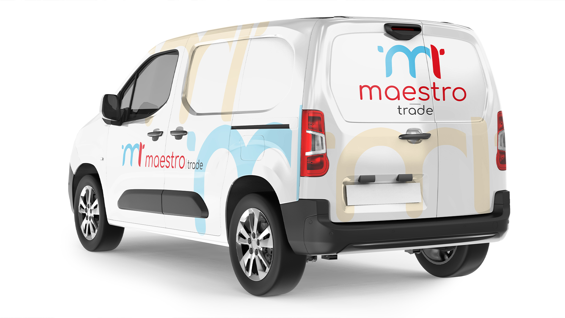
We created a clean and distinctive logo and standalone symbol for our client – a company specializing in the trade and distribution of food products. The visual identity reflects their commitment to quality and reliability.
We would like to thank Maestro Trade for their trust and for the opportunity to create their new visual identity!
Design
Our idea was to create a logo and standalone symbol based on the initials of the company name, Maestro Trade.
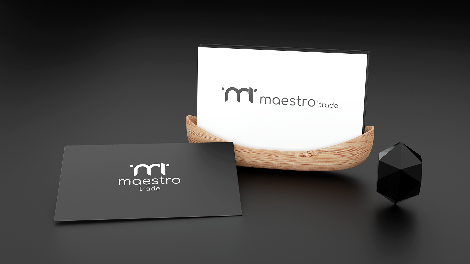
The design was developed to work effectively both as a standalone symbol and in combination with the full company name, creating a memorable and versatile visual identity.